As you can see I have included two criteria sheets. They give information about what should be included on your blog. We were asked as part of a task to mark our own blogs and give realistic feedback to ourselves. Where I have ticked certain parts that means that I believe I have achieved that specific thing. I awarded myself a grade D, mainly because I haven't quite finished my blog yet and still have things that I need to include, I also need to look at my feedback given in the comments from my lecturer. Therefore if I finish doing these things I could come out with a B.
Wednesday 22 October 2014
Fresh Magazine
As you can see I have used three different fonts for the task of choosing my magazine, I have named it 'Fresh'. The font for the first one I don't really like. It doesn't really connote fashion magazines. I think it would suit a music magazine more. As for the second font I actually do really like it and I think it looks extremely unique and stands out, this would definitely be more suited to a fashion magazine. It also in my opinion looks very modern and new. And finally the last font, I also really like this style and think it would work well on a fashion magazine however I don't think it would stand out and grab the target audiences attention.
Overall I definitely prefer the second font and I have decided that I will be using this for my own product. It stands out and certainly does look fresh. When I do create my magazine I will be only using the colour black, probably. The black is noticeable however it won't take away from the sell lines.
Marking Blogs/ Peer Assessment
Here are two images of the success criteria. As part of a task we had to get into partners and peer assess each others blogs. So each had a copy of the success criteria and would tick off anything in which we thought the other person had achieved. After thoroughly analyzing one and others work we both ended up awarding each other a grade C. I was overall very pleased with this, however I did get some feedback on things in which I could improve. I was told to include more ICT presentations within my blog, this would then help me achieve a higher grade.
Monday 20 October 2014
The Recce
I have decided that I will be taking my photographs of my model, for my magazine at Sunderland University. I have already chosen a model and will include a screenshot on my blog of model confirmation. Moving back onto hazards that could become a problem; there will more than likely be many wires around the studio which could cause problems for the model and myself, for example I could be taking the photo of my model and could quite easily trip over a loose wire and seriously injure myself. Another problem that we could face is the backdrop/ curtain. I know, having visited the studio previously myself, that there is a huge curtain in the studio, this could become dangerous because my model and I could may trip over this and again seriously injure ourselves.
To ensure that we overcome these problems I will, before the model comes in, look around the studio and check for any loose wire or cables lying around and try and tidy them up, I will also alert the model that she should look out and be aware that there are wires that she could trip over. I will also alert the model that there is a big backdrop and I will make sure that they are dressed sensibly, as in they won't be made to wear heels or any other type of footwear that could easily be caught up on the curtain.
The weather will not affect the outcome of the photos as I am taking them inside a studio, although if it were raining while the model and myself were on route to the studio then the models hair and makeup could be ruined. However I can overcome this by bringing equipment to dry the models hair and also bringing extra makeup, or even applying the makeup at the University, to make sure that everything stays in place.
I I have already planned how I want my model to be posing, what she will wear and what kind of background I want. I have decided that a plain background will be best. I am not sure yet though what color the background should be, but I will probably choose a plain white background. I have chosen to have a simple background as I don't want it to take away from the image or the sell lines etc.
Natural lighting will not be a problem of when I take my photos as I am taking pictures in a studio, there will be no reflections from flashes, as there will be a white backdrop, so I have no problems with lighting.
I will need permission before I go to the university to obviously take pictures. I will email the technician who works there and book an appropriate time for him and also for us. I need to do this because we aren't necessarily a priority, the students who attend Sunderland University are..
There will be no problem with crowding/ people spoiling the images because I will have booked the room/ space to take the photographs, so I will not be affected by crowding and people being in the room.
I have already asked my model, to model for me and she has ensured me that she will be able to come to the university in the up coming weeks in order for me to take photographs. As for props, I guess those will include clothing and makeup, I will bring those items, so my model won't have to worry about that.
Friday 10 October 2014
Re-construction of a Website
This is my reconstruction of a website. I searched for Vogue magazine on google and clicked on the first link; it lead me straight to this page. As you can see I have tried to copy the image. I asked my model to plait her hair and to pull the same pose as the original model. I created the Vogue text myself, by using photoshop. However I did screen grab the other text as I thought it would be easier. I did arrange the layout exactly, or tried, as the website screenshot shows. I found this reconstruction exceptionally easy and ejoyed playing around on photoshop.
Re-construction of a Billboard
This is my reconstruction of a billboard. Again I used the same model to complete this task. The models pose is extremely similar- a close up of the face, specifically of the glasses. This is to help sell the product to the audience, giving them an example of what the could have. I have also tried to imitate the background of which the model is standning against, which looks to me as though it is a wilderness theme (?). I have also inlcuded the whole white backing with the black Calvin Klein text over the top.
Re-construction of a Double Page Spread
I also reconstructed a double page spread. I am unsure as to where this double page spread is from however I am aware that it is from a fashion magazine because the article features Gisele Bunehen, who is a very famous model. Firstly the model and her pose, I did at first initially think that this would be something I would struggle with, however I was able to use my friend as the model (who featured in the reconstruction of a front cover and a contents page). However you will notice, again that the model isn't wearing clothing alike the model, although the background is kind of similar because of the trees etc.
The title text was easy enough to find and the colours was easy enough to mimic. Also the main texts font was pretty easy to find. I didn't necessarily write the same text but I ensured that the layout was similar.
Re-construction of a Contents Page
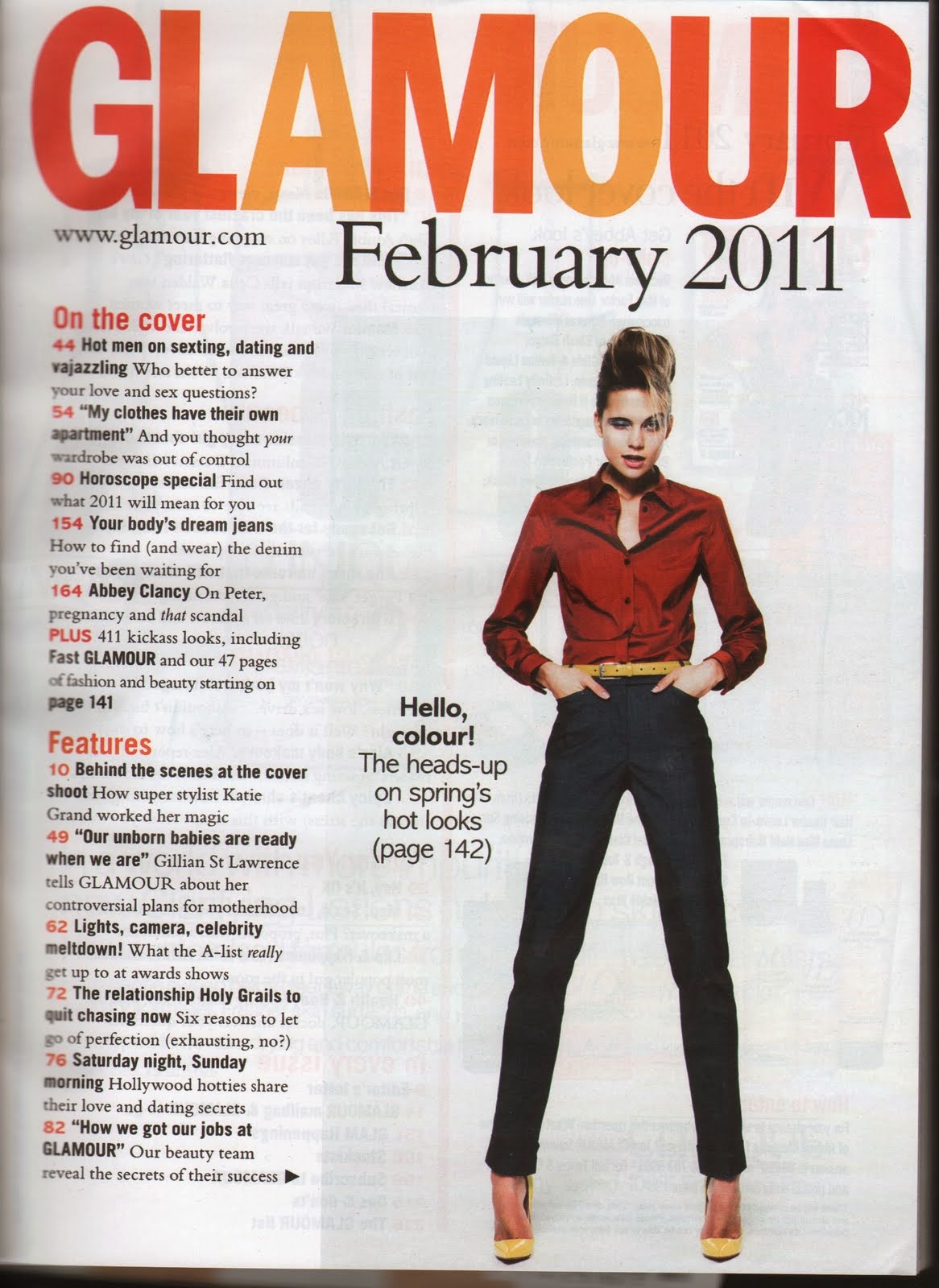
I also reconstructed a contents page. I looked on google and popular fashion magazines contents pages and chose the one I preferred, which was this Glamour magazine. As you can see I used the same model for both the magazine reconstructions. Although the models aren't, again, wearing the same clothing, I have tried to position them the same. As you can see the model is standing with her legs ajar with her hands in her pockets and she is staring into the camera. My model is posing like this, however like I mentioned previously my model isn't wearing the same clothing as the original model, therefore she wasn't able to put her hands in her pockets. But overall I believe that I have recreated this contents page quite accurately.
The text was the most straightforward thing to complete. To find the text I had to use Dafont, it didn't take too long to find, I then had to download the font and save it to photoshop. So I used this font for the 'Glamour' title. I then selected the correct colours like I did for the front cover (previous post). The main text was a little harder to do, as I did struggle to read the original copy and it was hard fitting everything in on one page, however I did do it.
Re-construction of a Front Cover
I have re-construted this front cover from Vogue magazine, I decided to use this magazine because, obviously, my magazine genre is 'fashion' and Vogue is a top fashion magazine. I believe that recreating this magazine was considerably easy, I made my model pose similarly to the model/ singer 'Lana Del Rey', she has her hand placed underneath her chin with her arms crossed, so this was very easy to recreate. To edit the text onto the image I used Photoshop, I found using photoshop easy because I have used it in the past.
My model was originally standing against a white wall, however the magazine front cover shows the model standing in front of a pink coloured backdrop, so to change my background I used the paint brush tool on photoshop. As you can quite clearly see, the models clothing aren't matching, I did try to match the makeup and hairstyle of the model, they are both wearing very neutral shades on the face and their hairs are a similar colour.
To ensure that the texts were similar I thoroughly checked the fonts on photoshop and selected the ones which I believed looked most like the original Vogue magazine. As for the colours, I used the tool to select colours, by clicking the pink text from the vogue magazine, photoshop picked a colour that was most like the pink on there.
And finally the layout, this was the easiest task to complete. I literally placed the text i.e. mast head at the top of the page and the sell lines by the side of the model.
Subscribe to:
Posts (Atom)